Contents page analysis
Entry number 8- Contents page analysis:
HAPPIFUL magazine contents page:
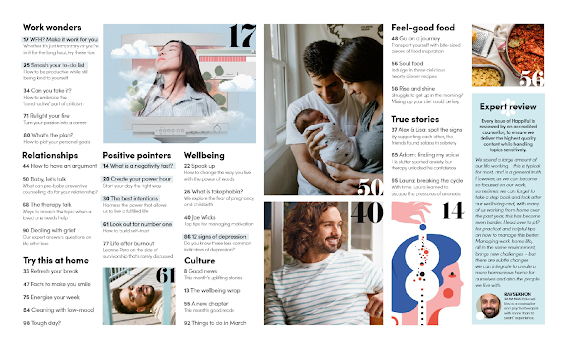
The contents page of the ‘Happiful’ magazine uses a bright colour palette and bold text with a variety of fonts. The contents page layout is unique from other magazines as it sorts pages by its topic, e.g. ‘wellbeing’ or ‘relationships’, similar to an index page. It helps the reader quickly find their target for reading the real-life mental health magazine. There are also certain images with large bold page numbers, these are the highlights of the magazine, e.g. page 17 represents the blue image with a girl looking up which was actually the front cover of the magazine, which intrigues the reader into flipping to page 17 and reading what the image was actually about. Within each section of each topic, the subheadings including the page number also has a short few sentences to give more insight into the page.
The page also includes personal stories shown clearly in the ‘True stories’ section, with pages linking to them and short snippets of the story, e.g. ‘His stutter sparked anxiety, but therapy unlocked his confidence’. This suggests the magazine has a more serious approach on the contents page where its clear aim is to light sparks and inspire people. The way in which language is used in this contents page suggests it’s aimed towards anyone of any ages struggling with low-confidence and other mental health conditions, as well as anyone struggling in relationships or needs inspiring.
Many of the featured articles and images also show that they are family related, e.g. the image of the male and female holding a newborn baby, and ‘soul food’ recipes. Therefore, the magazine has a very diverse audience, as young adults to couples to parents could read it.
Besides just the contents page simply stating what is included in the magazine, there’s also an ‘Expert review’ where a certain expert reviews the magazine to ensure it delivers the highest quality content. The reviewer for this magazine was Rav Sekhon who is ‘a counsellor and psychotherapist with more than 10 years’ experience’. The magazine also includes an image of Sekhon. This makes the magazine more credible and allows the reader to put trust into it.
PLATINUM magazine contents page:
Contents page analysis:
The contents page of platinum magazine mainly makes use of
light colours such as pink, blue, white and purple, where the main colour
scheme is white, black and pink. This implies that it this magazine sticks to
the conventions that a magazine would usually tend to have and the use of the
same three colours on this page makes it easier for readers to catch on with
subheadings etc. This is a difference to the ‘Happiful’ magazine as it only
uses a few colours. The use of light pink portrays femininity, which further
emphasises that it is a magazine aimed towards women - perhaps women from ages
16-40. Light blue being placed in a few areas of the contents pages creates a
nice contrast from the pink and it may connote strength, and confidence which stereotypically
are associated more with men - and so
this is conveying encouragement for women to also gain confidence. As for the
colour white - it can suggest purity and innocence.
The contents page layout is similar to the 'Happiful'
magazine because page numbers are not in order of lowest to highest but have
been categorised into certain subheadings. The page numbers and subheadings a
dark pink typography has been used to maintain the colour schemes of the pages
and highlight femininity and a aim these topics such as health towards a female
audience. The title of contents is black and is a bold serif font. This font
type is masculine - linking more to confidence one again and it may at the same
time create a feeling of elegancy. In one section of the contents page there's
a list of people and a brief outline beneath their names to address to readers
in a sentence just what these peoples personal stories and about their life and
well being. However, in ‘platinum’ we only see stories from a female
perspective since the magazine is geared towards women and their confidence in
life.
Platinum magazines contents pages uses a face/body shot of
the same women that it has included on the front cover of this magazine. However,
on the contents page the shot is not as much of a close up as the cover one and
for the contents page she is dressed in a dark blue suit, which is a bold
colour representing boldness in itself. This image takes up majority of the
right side of the first side of the contents page. In comparison to the front
cover in terms of images - it differs because the front cover only uses one
image of the woman whereas; the contents pages use more images besides the
woman. The images take up most of the page on these pages than the writing to
stress even more about the different topics being outlined. A variety of other
images on this page and the next contents page that relate to the topics of the
subheadings.


Comments
Post a Comment